« Back
The Corporation for Independent Living Launches New & Improved Website
July 2nd, 2018
The Corporation for Independent Living (CIL), a real estate development firm for nonprofits based in Hartford, CT, has launched their newly redesigned website with the help of SoSimple Interactive.
SoSimple Interactive also designed and implemented CIL’s “teaser” site – a temporary, 2-page website with quick facts and contact information – before completing and launching the company’s new and vastly improved full website.
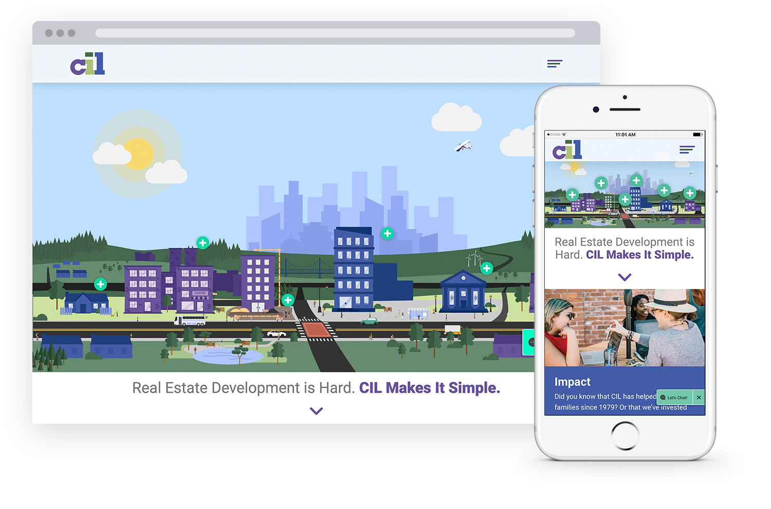
The newly launched full website keeps on-theme with CIL’s current branding, bringing in colors from the company’s logo, as well as font style, and professional photography of the CIL Hartford, CT office and it’s employees to showcase the warm and inviting atmosphere the company has created.
The 2-page teaser site flowed seamlessly into the new full site, which uses custom developed features from the teaser site, including a custom developed content template to show case AccesSolutions information in a colorful and easy-to-operate rollover style.
CIL’s new site features multiple custom animations, including a full span town scene on the homepage, as well as multiple small animations on the Impact page – making up their Impact Report. The homepage animation features 6 stylized rollover points, which act as links to each of CIL’s Solution offerings.
The new website is robust, making great use out of SoSimple’s recently revamped content page editor in order to create custom colored header boxes on each page. Customized page templates are used throughout the site, allowing the company to add custom flare and style to any page on their site with ease. A custom template for individual open job positions was created to link with the Job Board page type, allowing CIL to alter and update their currently vacant positions on any page of their site.
The site also features robust Team and Project sections utilizing Link Image Grid and a series of hidden subpages for each member/project. Custom filtering options, such as “People Who Have Impressive Sneaker Collections” and “People Who Have Fun Eating”. A matching Portfolio Builder page style was developed for the Tools & Resources page, allowing multiple filter menus to be used.
A custom build-out of the AccesSolutions section allows the new full website to feature all of the same content as the teaser site, but re-styled for the flow of the new site. Multiple important event registration Form Builder pages were brought over, allowing the client to seamlessly transition from teaser site to full site, with the peace of mind that all event registration information was still able to be accessed and captured.
A small “Let’s Chat” module on side of the screen allows site users to easily access CIL’s contact form from any page on the site, but also allows users to “X” out of the notification if they wish to remove it from the page they are viewing.
The new website includes responsive, mobile-optimized design allowing the site to automatically reformat to ensure that content is always displayed in an optimal manner across all viewing platforms - desktop, tablet or mobile.
Posted in the categories Featured Announcements, Clients News.


