« Back
Friar Associates Launch New Website
June 20th, 2016
Friar Associates have launched their newly redesigned website with the help of SoSimple Interactive.
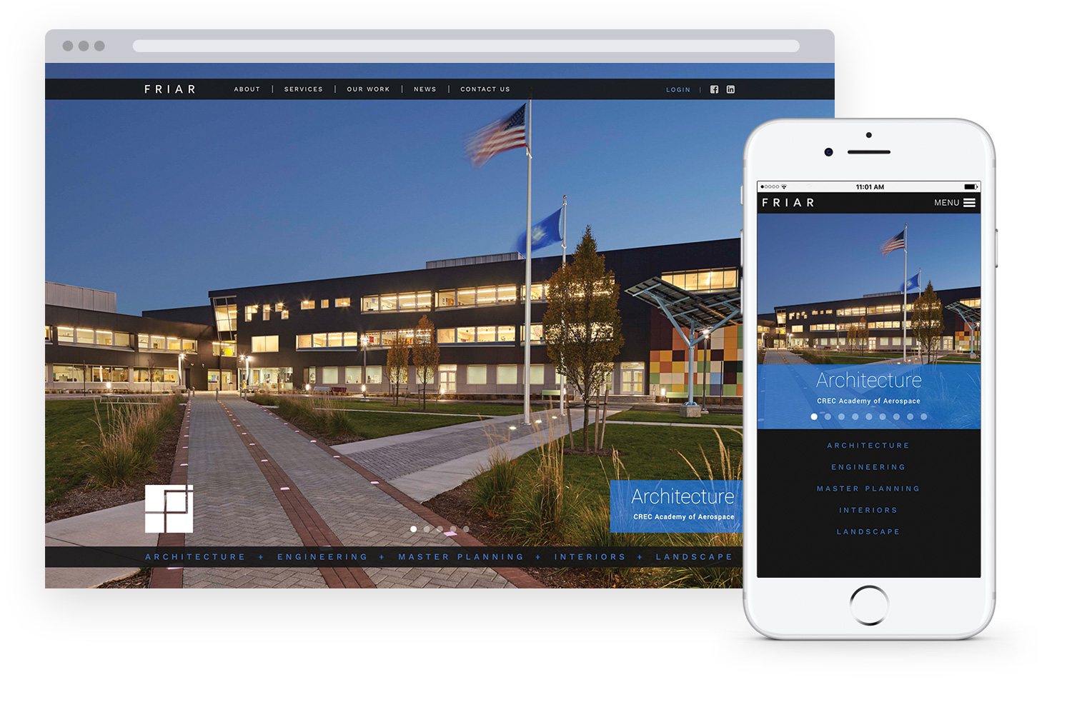
Visually captivating and very photo-centric, Friar Associates’ redesigned website is a feast for the eyes. The website’s homepage features a visually stimulating, full page scrolling image banner showcasing the company’s work.
Friar’s Website has made great use of the link image grid and photo gallery page types.
The new site’s “Leadership” and “Services” pages feature link image grids, which lead to individualized, half-page photo galleries featuring pictures of the employees and hobbies they enjoy, and the various services that the company offers. These photo galleries allow you to switch from gallery to gallery by clicking the “next” button, creating a friendlier user interface by eliminating the need to hit the back button every time.
The portfolio section, “Our Work,” is a photo-centric link image grid. When a project is clicked, it leads to a full page photo gallery with a caption that is both expandable & collapsible. This page features a category filtering system, allowing site visitors to filter the number of elements on the page.
The “News” page is also set up using a link image grid, instead of the standard News page type. This unconventional way of displaying this type of information works well with the photographic nature of the site, and keeps the user interface consistent for better ease of navigation.
The website is photographically driven, accompanied by dark backgrounds and the light blue of Friar’s logo creating a visually pleasing aesthetic for the user.
For mobile users, the new website includes responsive, mobile-optimized design, allowing the site to automatically reformat to ensure that content is always displayed in an optimal manner across all viewing platforms - desktop, tablet or smart phone.
Posted in the categories Featured Announcements, Clients News.


